Hardie projects
Hardie Projects is a project management company run by Mike Hardie. He’s a specialist in procurement, planning and inter-agency coordination. Delivering infrastructure projects that are practical, collaborative and outcome-focused.
A new business needs a new brand so Mike and I teamed up to create a visual identity system that would suit the industry, yet stand out from the competition. Mike’s superpower lies in his relationships with people, getting the best out of everyone through clever collaboration. This trait became the starting point for this project.
SERVICES
Visual Identity Design
deliverables
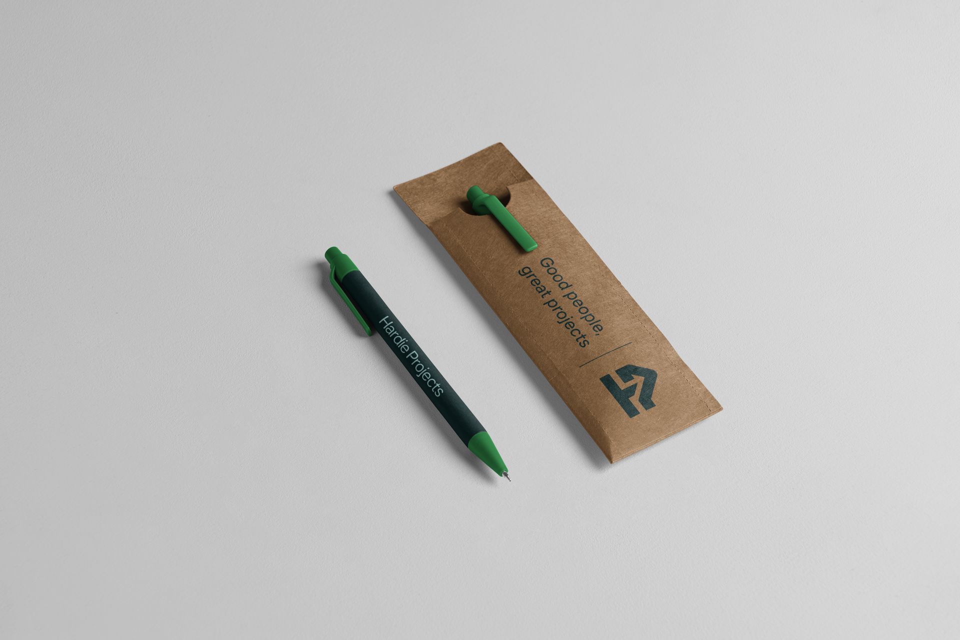
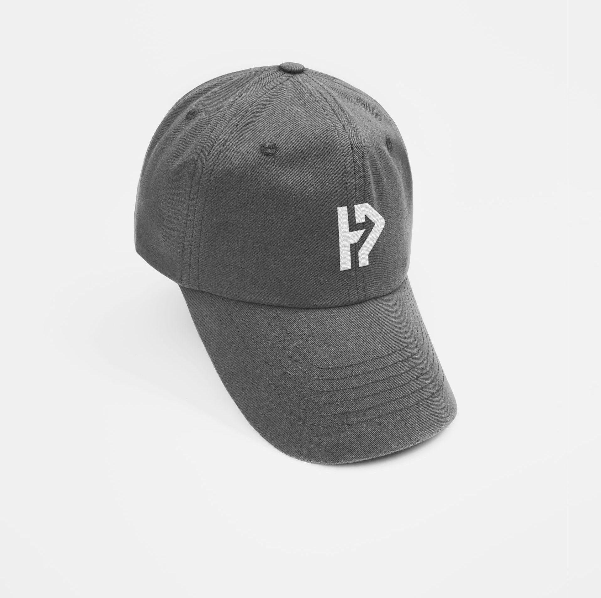
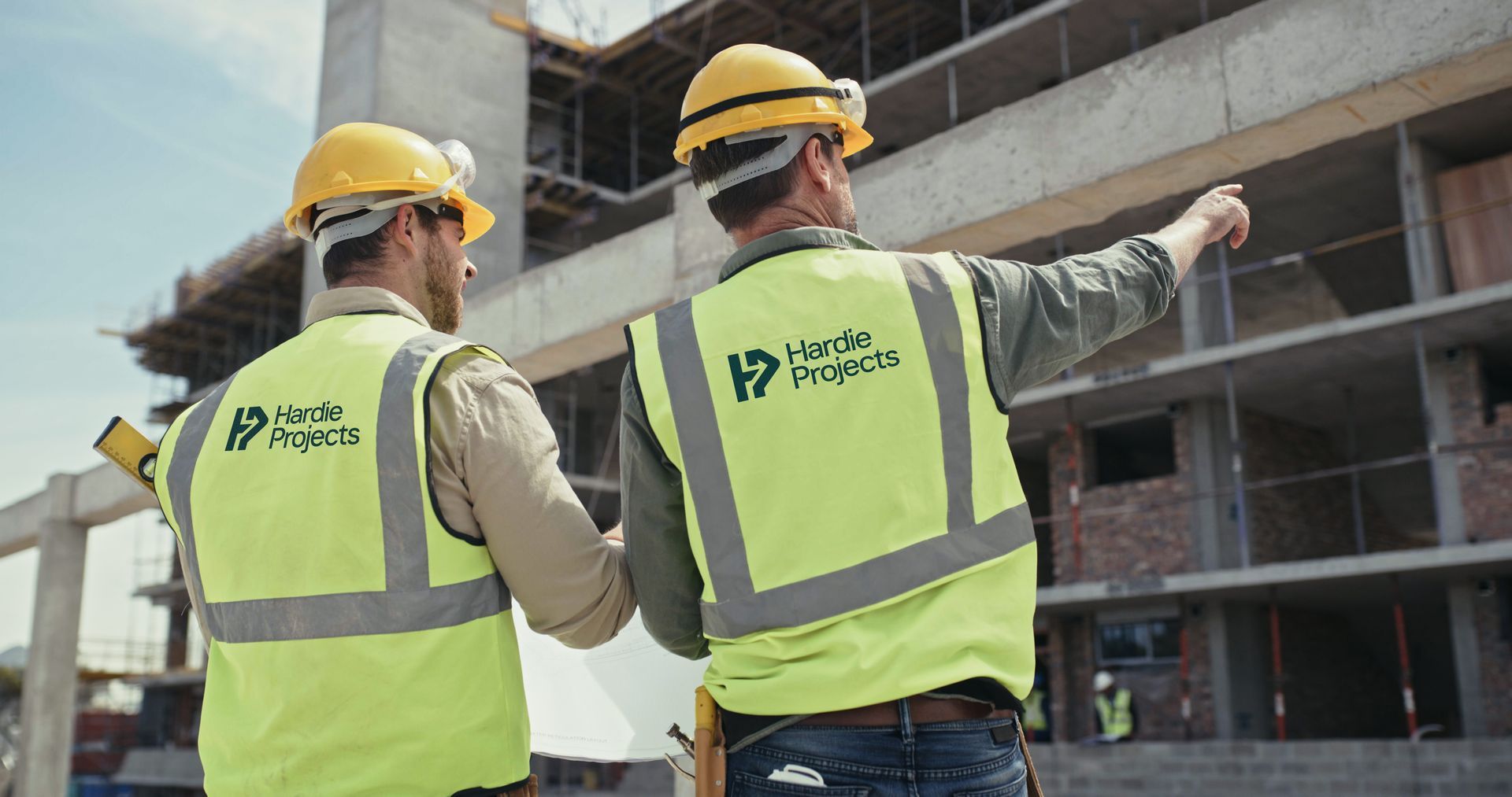
Logo | Illustrations | Marketing Materials | Document Design | Apparel Design

A Project Management business that stands out from the competition.
I had the honour of working with Mike on a very personal, yet simple goal - to create a brand that would stand the test of time, in a market that's saturated with project management companies operating in New Zealand. The main goal for Hardie Projects was to be different and stand out from
the competition.
I was given full creative control and I decided to take an unconventional approach. To do something that looks and feels human and truthful, not simply doing the same as everyone else.
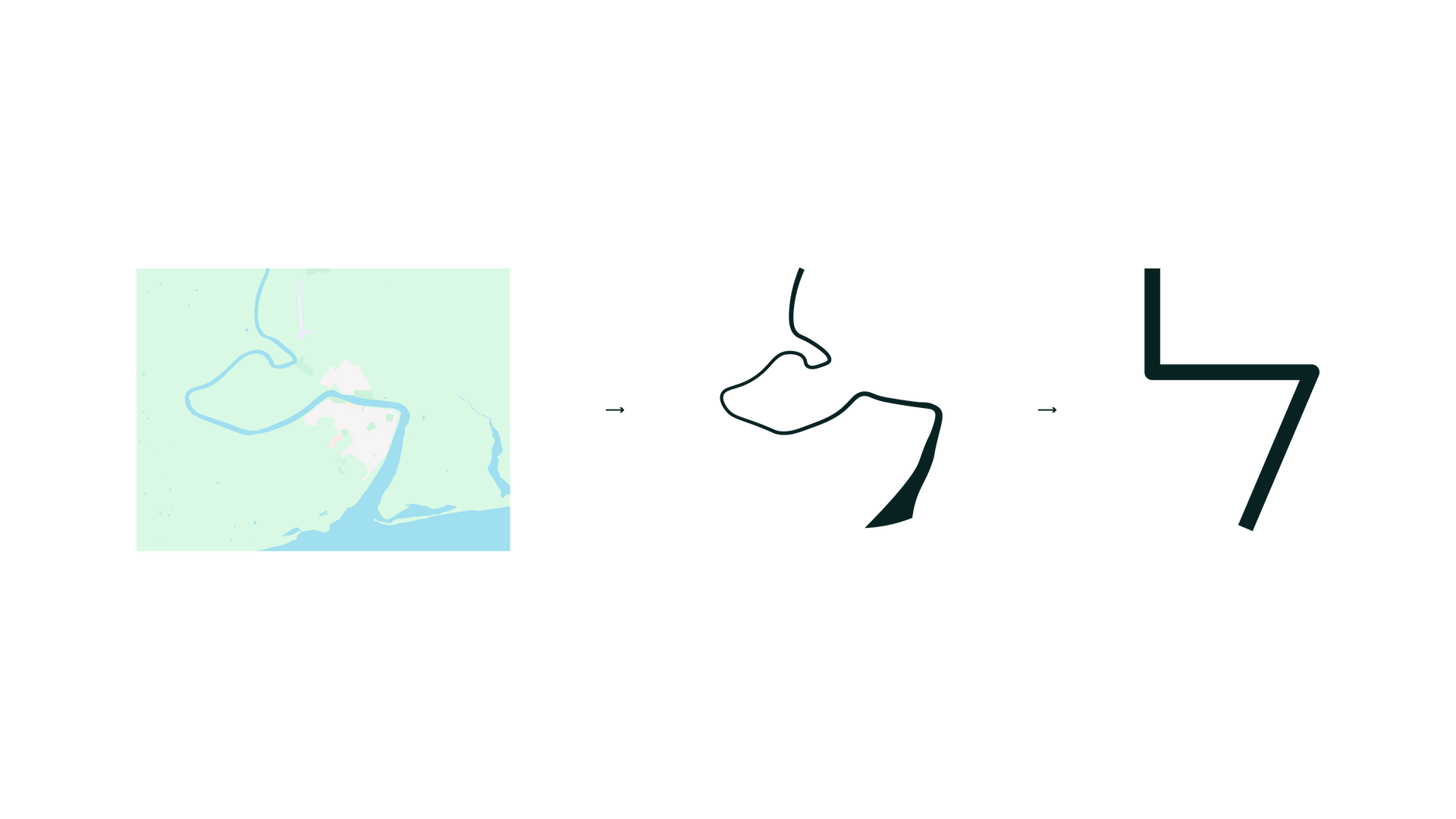
Mike and I came up with the following themes we wanted to include in the new visual identity system: infrastructure, the Wairoa River, connection & growth.
To be perfectly honest, it took many (MANY) hours of sketching before I landed on a few concepts that met our criteria. The best logos are absurdly simple, but also absurdly hard to come up with. I worked out three sketches and showed them to Mike. We quickly eliminated the two average solutions, as we loved what is now the final logo.
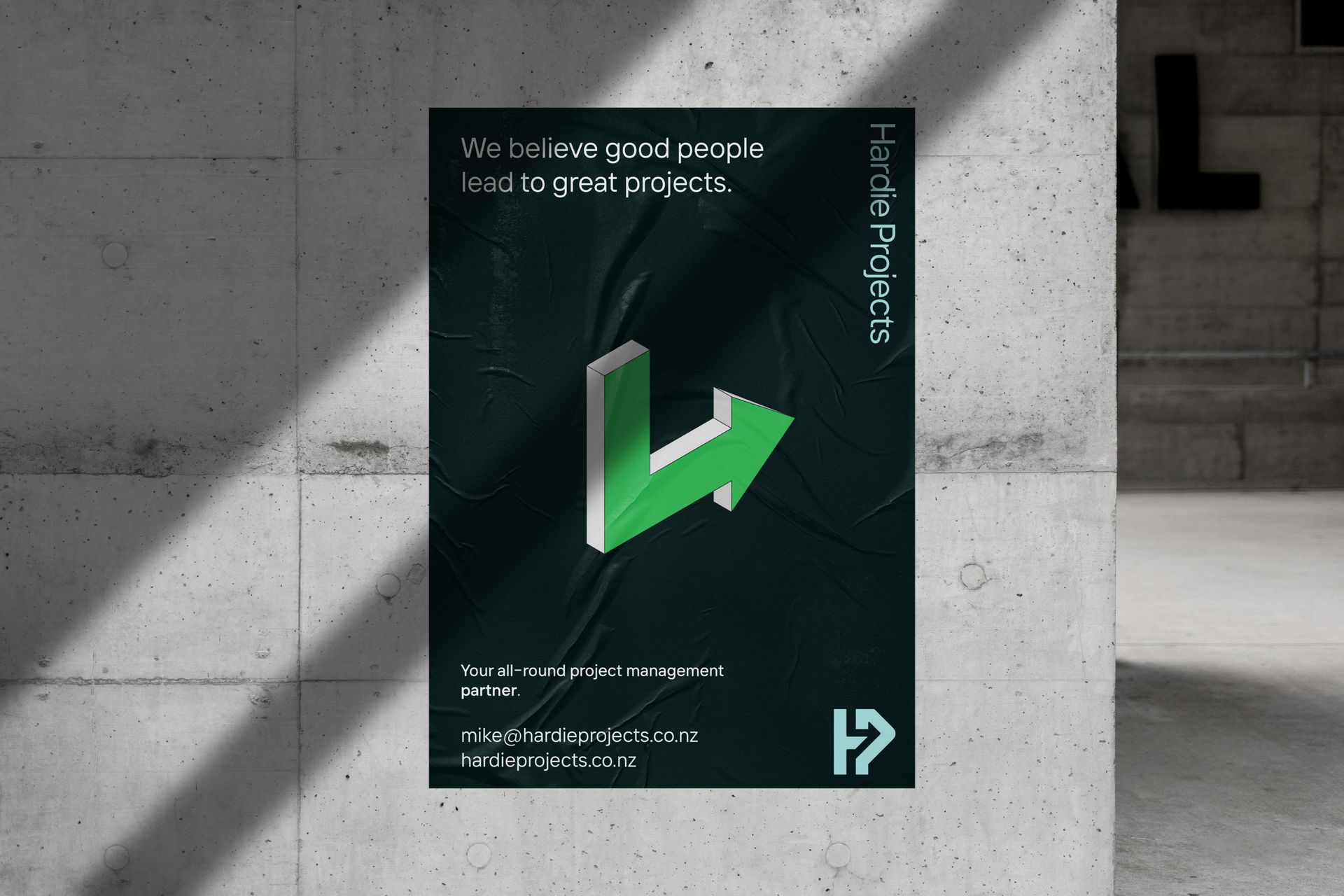
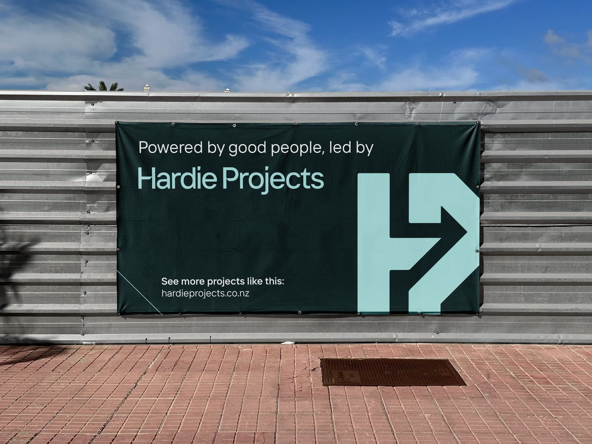
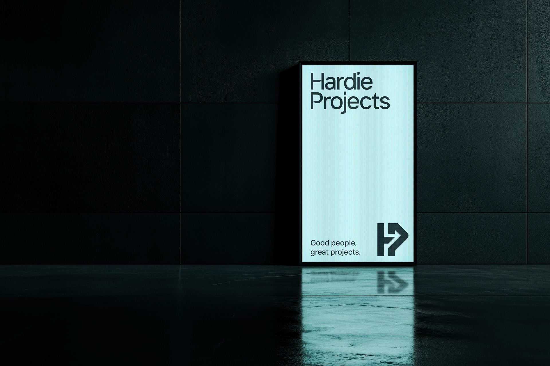
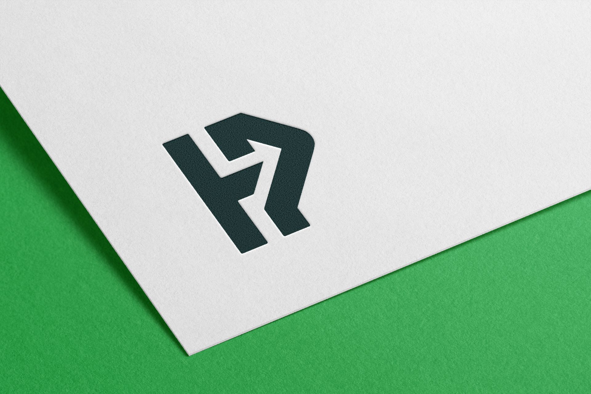
Merging the brand’s initials H and P symbolises connection between people through collaboration, Mike's superpower. The arrow appearing in the negative space stands for growth and always moving forward together. And emerging between the two letters is a simplified outline of the Wairoa River, the eye-catching body of water in Wairoa, home of Hardie Projects.
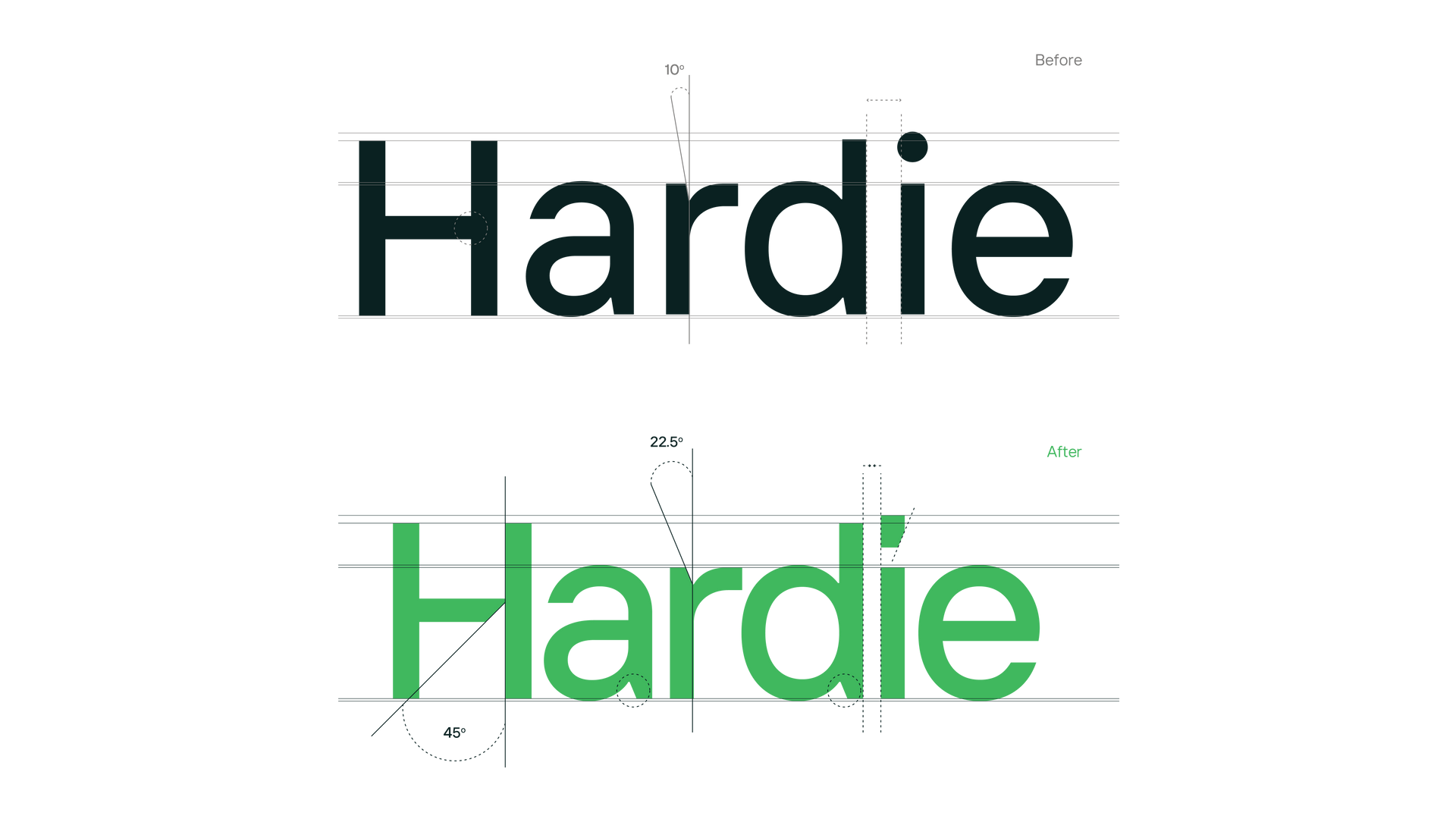
The execution of the final logo is kept simple, using straight lines and sharp angles to link back to the infrastructure industry Hardie Projects operates in. For the logotype I chose a modern, sans-serif font, masculine and friendly. I manipulated the existing sharp edges to complement the HP monogram.
Bringing life to abstract themes.
To bring the whole identity to life we created a set of illustrations to help tell the brand story. At the centre of it all is the arrow illustration, which can be used in many different situations as it comes in two different versions - a flat version as a complementary brand symbol/icon, and the isometric version showing perspective (think technical drawings).
The full library of illustrations is constructed in the same isometric style, to live and represent Hardie Projects’ new brand. They help explain abstract concepts that would otherwise require long descriptions and narrative.
These illustrations are really what sets Hardie Projects apart from many competitors. Where you would see images of projects as backgrounds and cliché 'Meet The Team' sections, Hardie Projects feels more approachable through storytelling. Combined with the colour palette we created a professional brand while providing a spark of youth and innovation.