Mionny Enterprises
Brothers Mike and Jonny, entrepreneurial from a young age, officially launched their business a few years ago. But in reality, Mionny Enterprises was established back in 2002, then known as The Mionny Adventure Course.
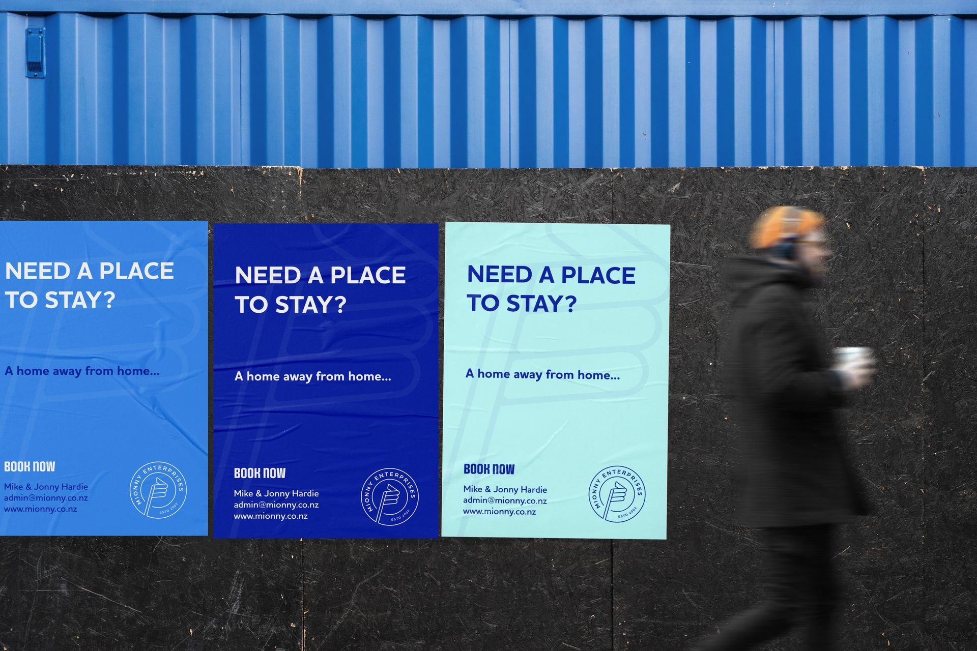
Mionny offers different services but their main focus is affordable accommodation - a home away from home. When things started to pick up and they acquired a second property, they decided they needed to create a smooth customer experience and the ability to market their services. We decided it was important to acknowledge Mionny’s roots in this new identity and got to work.
SERVICES
Visual Identity Design
deliverables
Logo | Marketing Materials


Sometimes it just clicks right away.
This project was one of those rare instances where everything just falls into place quite quickly. We started as I usually would, with the client brief and
research phase.
Based on the research I provide the client with a creative direction. This includes things like a competitor analysis, target audience and brand nouns, as well as two mood boards that visualise the potential look and feeling of the brand. One of the mood boards hit the mark and we proceeded straight to the design phase.
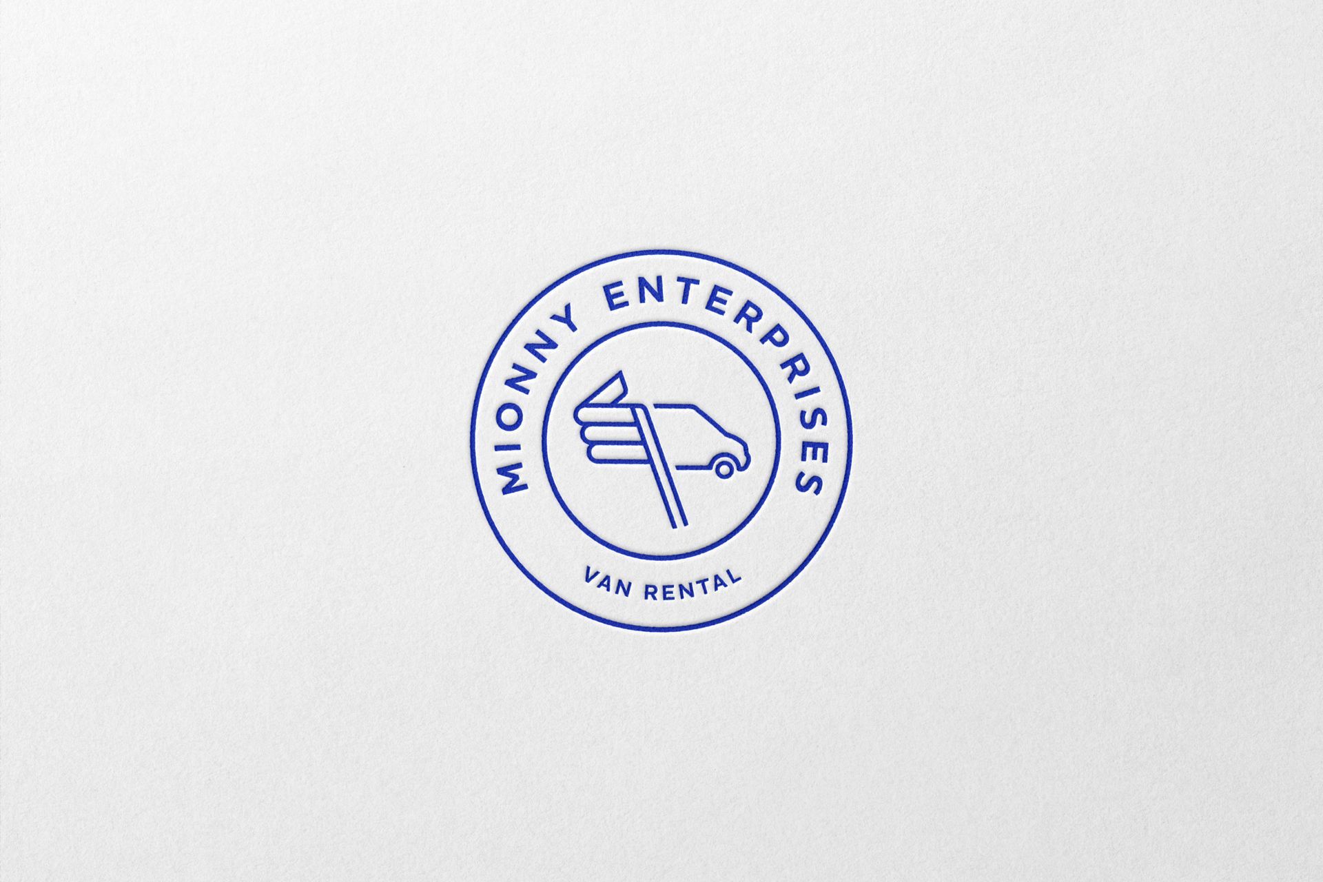
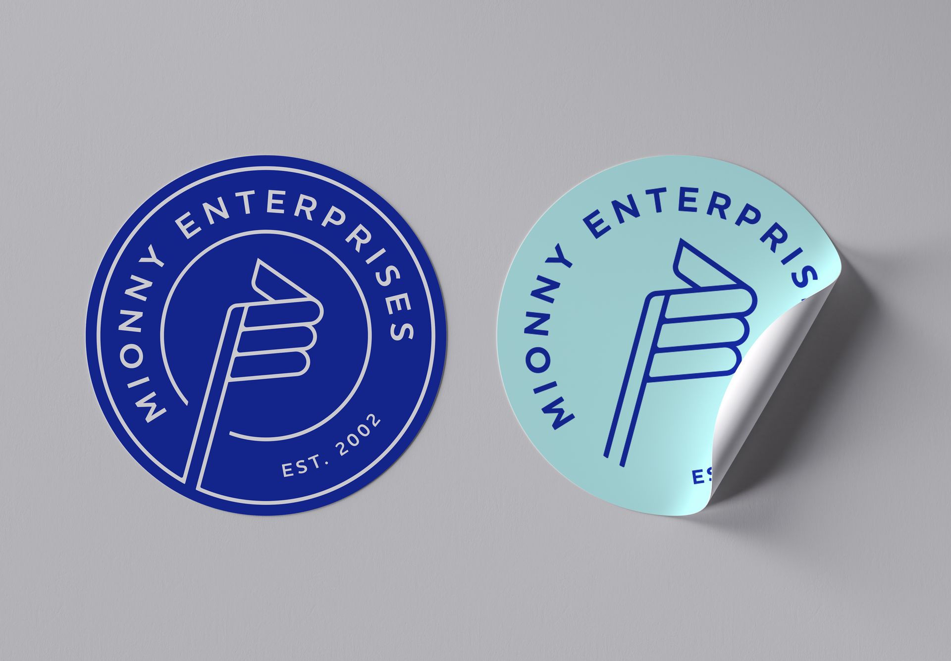
Like any good course, The Mionny Adventure Course proudly flew a flag back in the day, fabricated by hand by the brothers themselves. This was an early sign of what was to come.
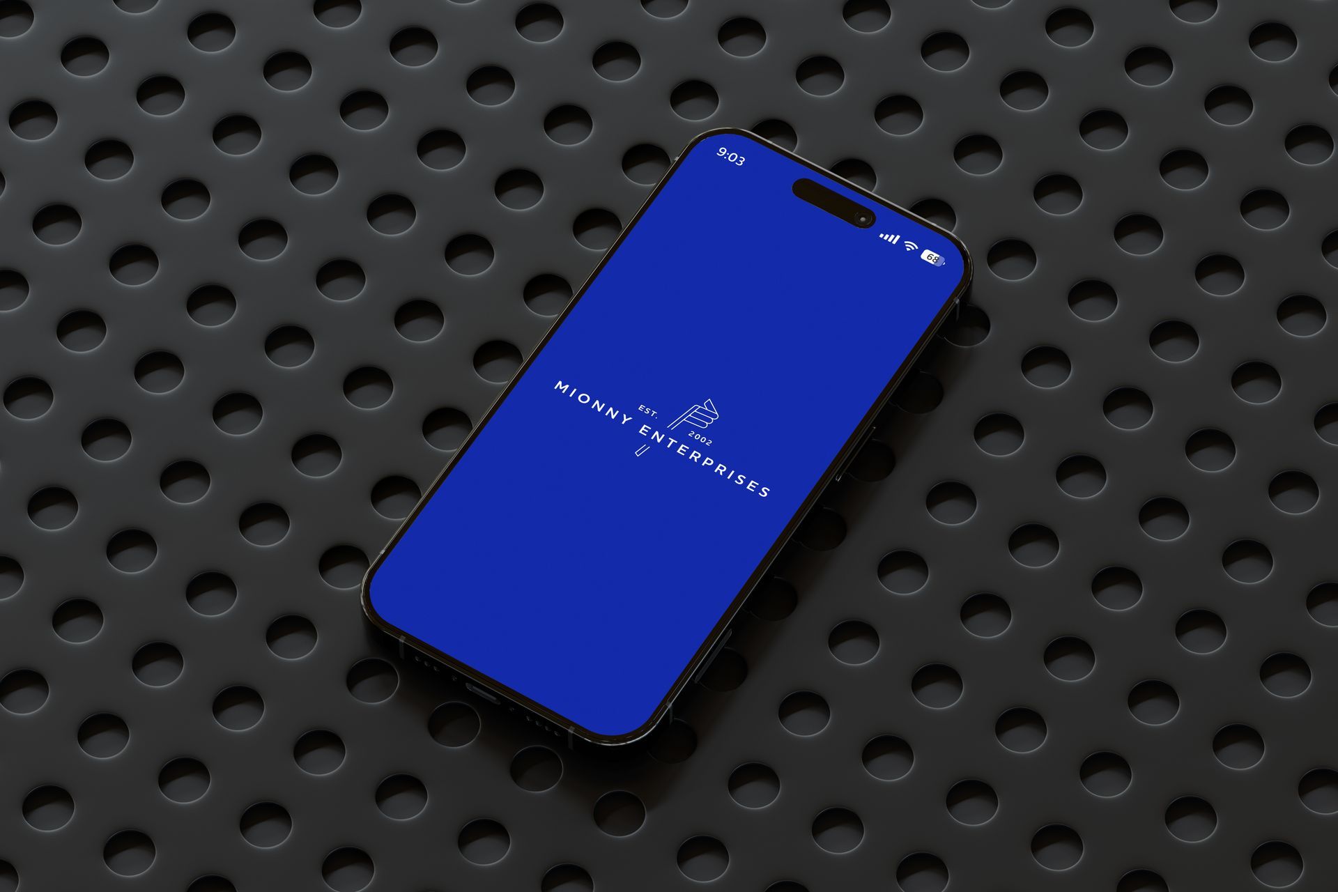
After only a few sketches I realised there was a way for me to incorporate the brand’s initials into a flag. This clever solution nods to Mionny’s humble beginnings and ticked all of the creative direction boxes we’d set out.
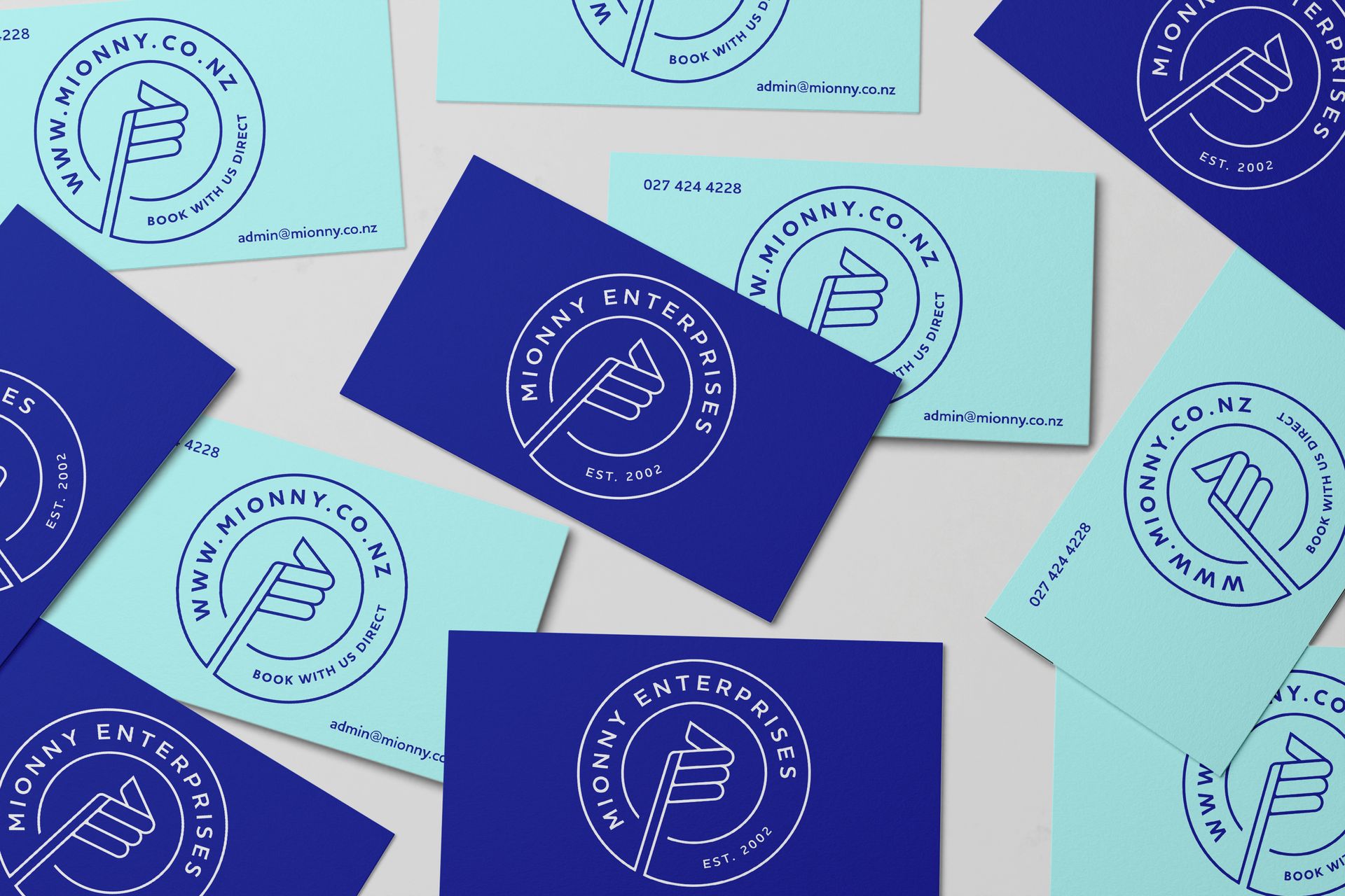
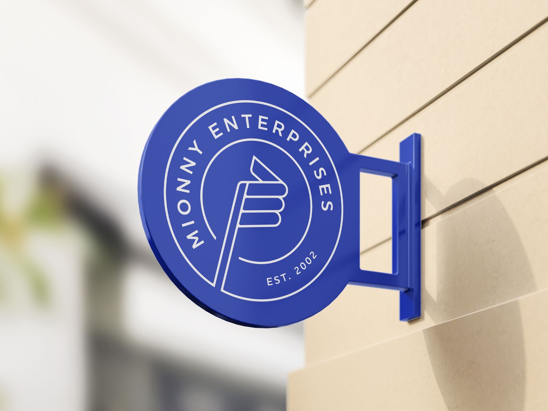
The final logo is a badge design with the ME flag nicely connected to the outer circle. It’s modern, clean and uniquely Mionny.

WITH EXPANSION IN MIND.
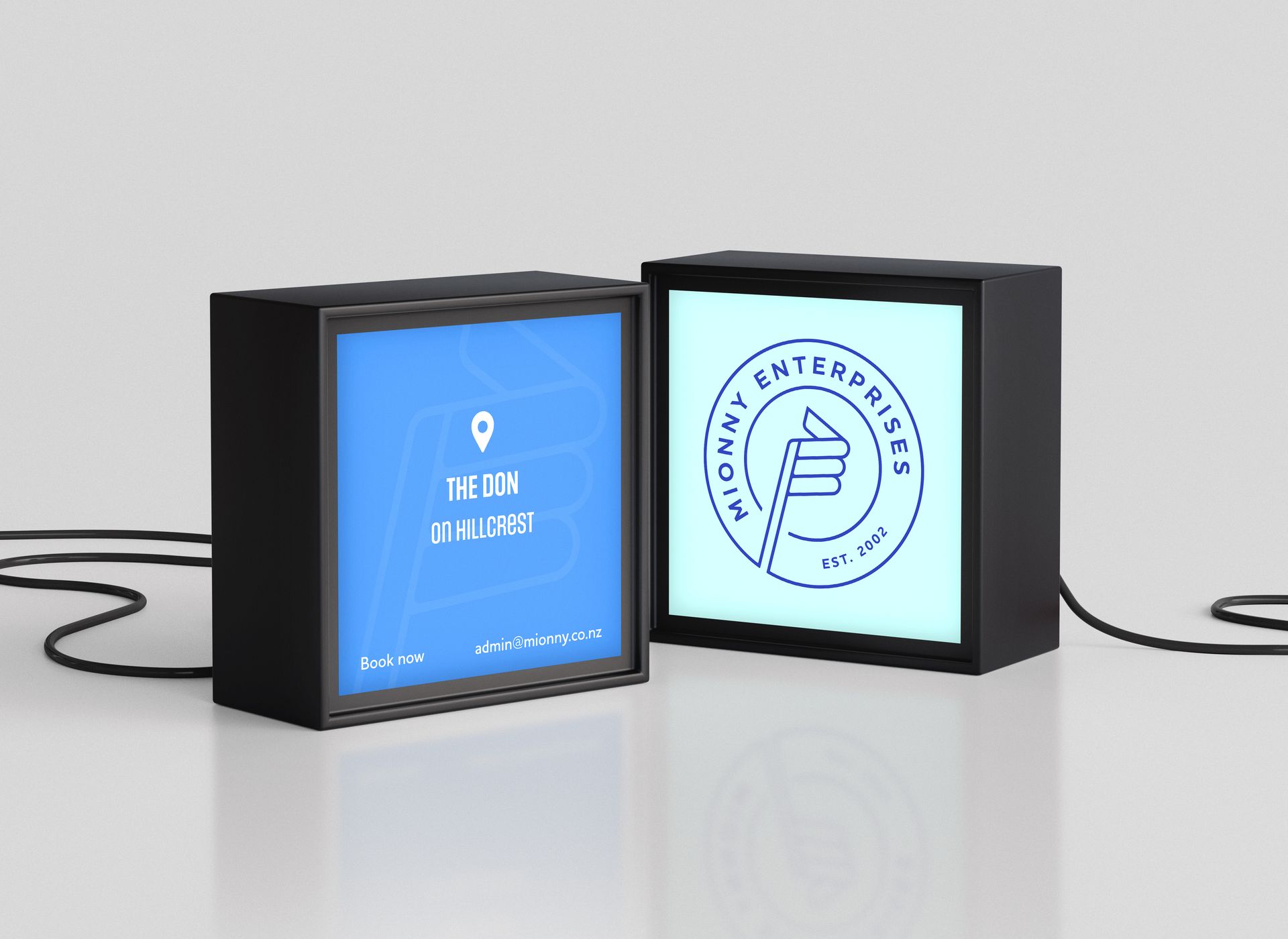
The broader idea behind the style of this logo is that it’ll be adaptable to any future expansion of the business. Mionny Enterprises provides a wide range of services. The round badge shape with a symbol in the centre and text around it, allows us to interchange these elements depending on the relevant service or topic.
For instance, Mionny’s secondary service (after the accommodation arm) is vehicle rental, with a 12-seater van called The Van leading the fleet. So we created a new symbol to replace the flag and changed the text to
‘VAN RENTAL’.
This can be replicated repeatedly, for a wide range of services or products. It ensures the longevity of the brand without losing that unmistakable Mionny feeling. Combined with the colour palette, it makes the brand extremely versatile and allows us to easily differentiate visually between ME services.