Ora iti
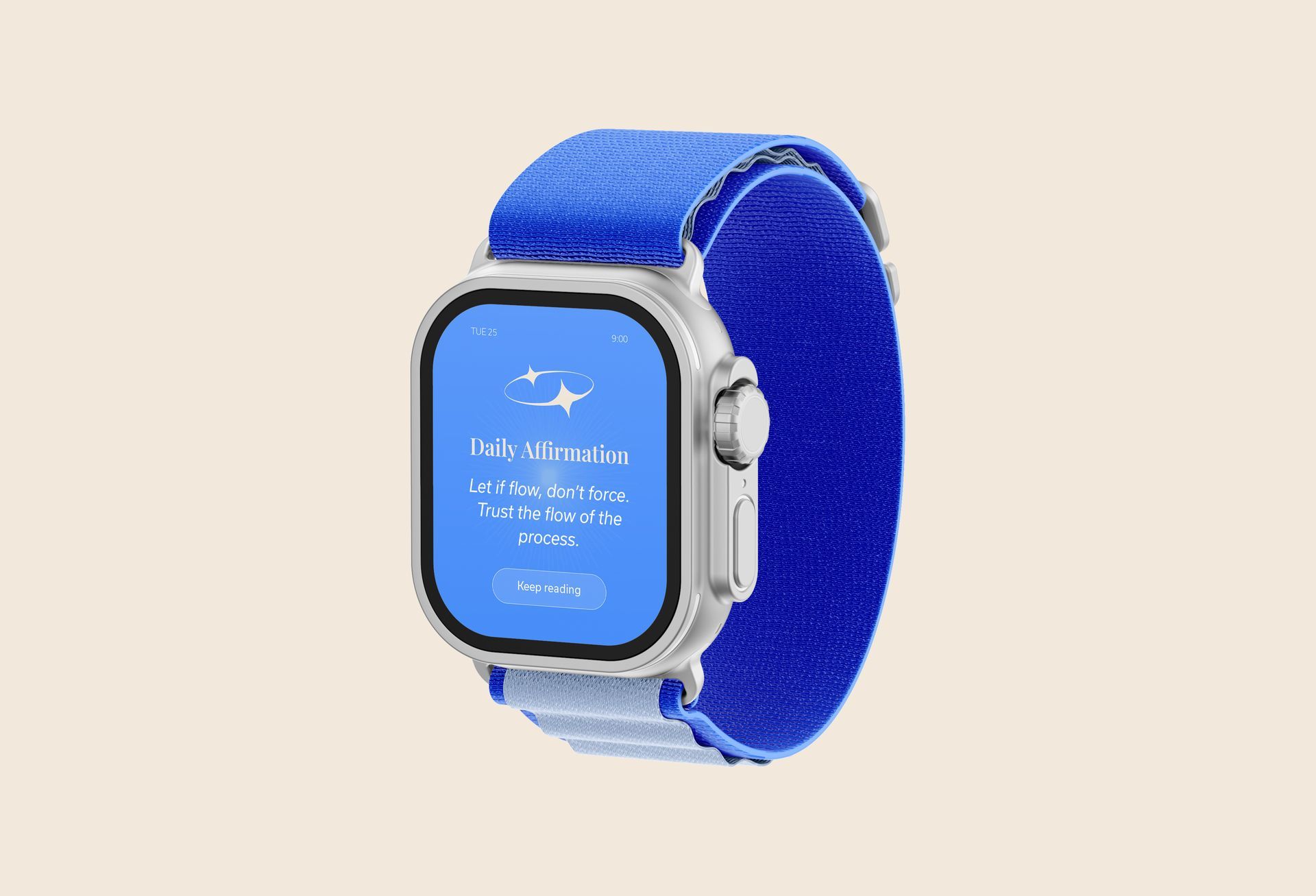
Ora Iti helps wāhine on their journey toward a life that feels whole and grounded, celebrating the power of the little things. Founder Carol helps women find empowerment through self-care.
Not your average life coach - Carol focuses on the importance of all the little things. Because they are not small, they are everything. Carol came to me needing a brand for her newly established business, and it needed to reflect exactly that. The goal? Build an authentic and professional identity that feels like a calming deep breath andembraces Carol’s Māori culture.
SERVICES
Visual Identity Design
deliverables
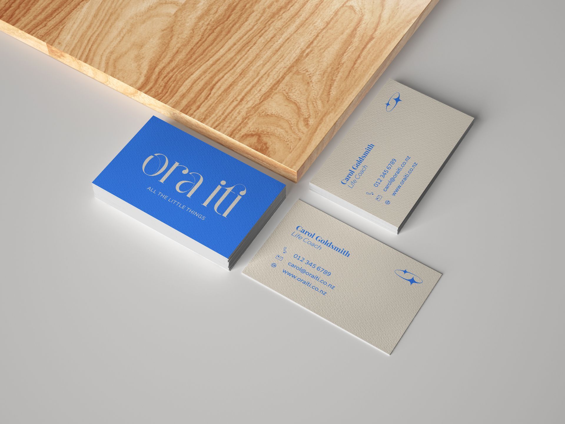
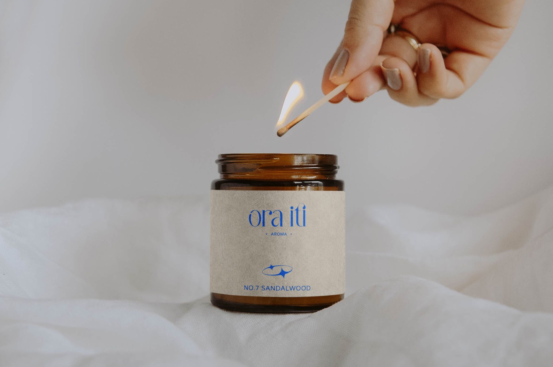
Logo | Marketing Materials
Always keeping an open mind is key.
Carol had already created a solid foundation: a great business name and a clear idea of how her brand should feel.
The first phase of a Uniek project consists of a bunch of research and brainstorming lots of ideas. A great tool is word mapping, which is about seeing the bigger picture and creating possibilities. I request a brief from the client and start with noting down interesting words and phrases. From here I associate words and things with these main themes - there are no rules here!
The main themes for Ora Iti were: wellness, the little things and Māori. From there, a lot of other interesting things started to appear in three’s. This led me to sketching a bunch of ideas that creatively seemed to head in the right direction, but didn’t quite suit the style Carol was looking for.
At the early stages of a project, it’s absolutely essential not to lock yourself in too quickly, and instead explore all options. As I got a little stuck on this idea of three’s, I decided to focus on the type instead and make sure it captured the right feeling for the brand.
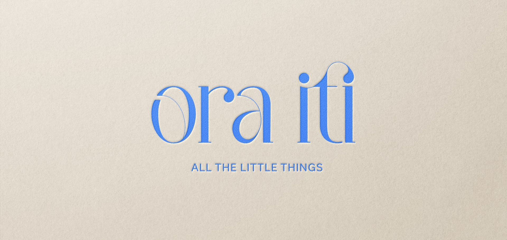
We landed on an elegant type with thin line details to make it feel open and light. The letters flow beautifully to reflect the flow of the life coaching process. For overall balance we added the brand’s tag-line underneath.
The starting point was a font that's elegant but also simple enough to allow for great customisation. Nearly everything about the letters has been changed to the point you wouldn’t recognise it now.
ONe logo is not enough. wait, what?!
Your logo is your only logo yes, entirely unique. But it’s absolutely essential that your brand is responsive, meaning that your brand can adapt to any
situation. For example, have you ever noticed the very small icons that appear when you’re browsing online - the ones on the tabs, only a couple of
millimetres wide? They’re called ‘favicons’ and that’s probably the smallest your logo will ever appear.
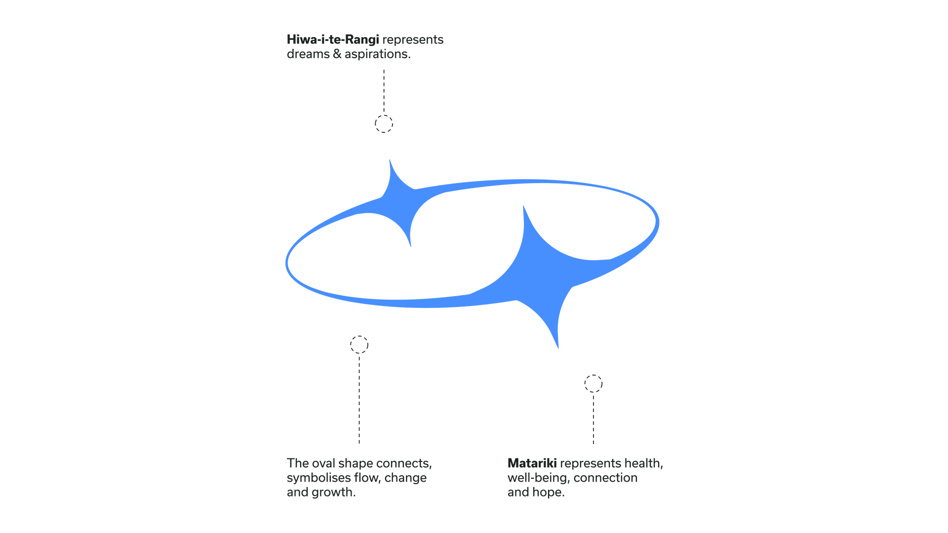
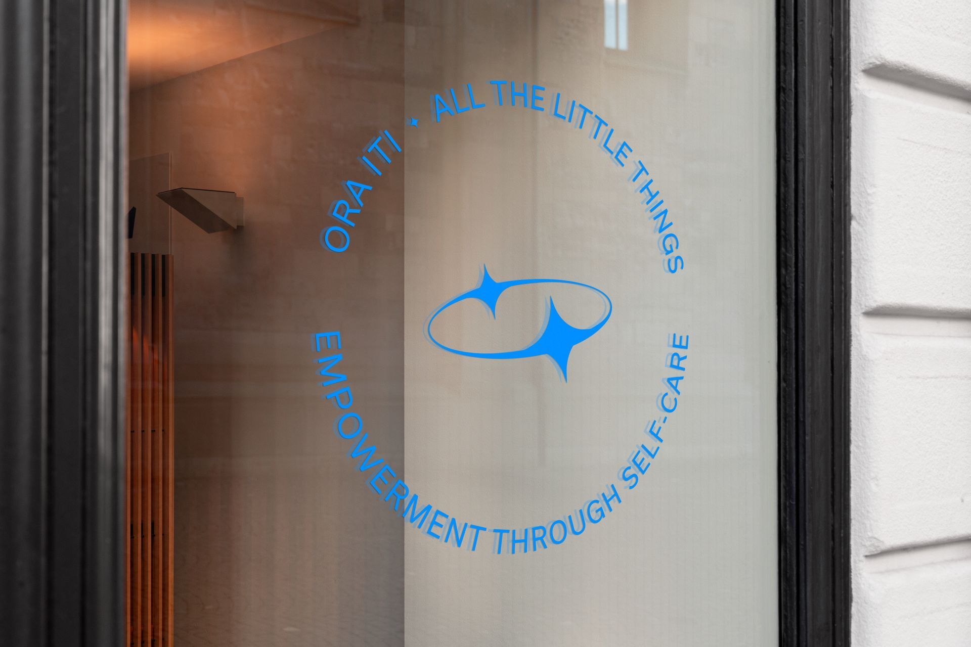
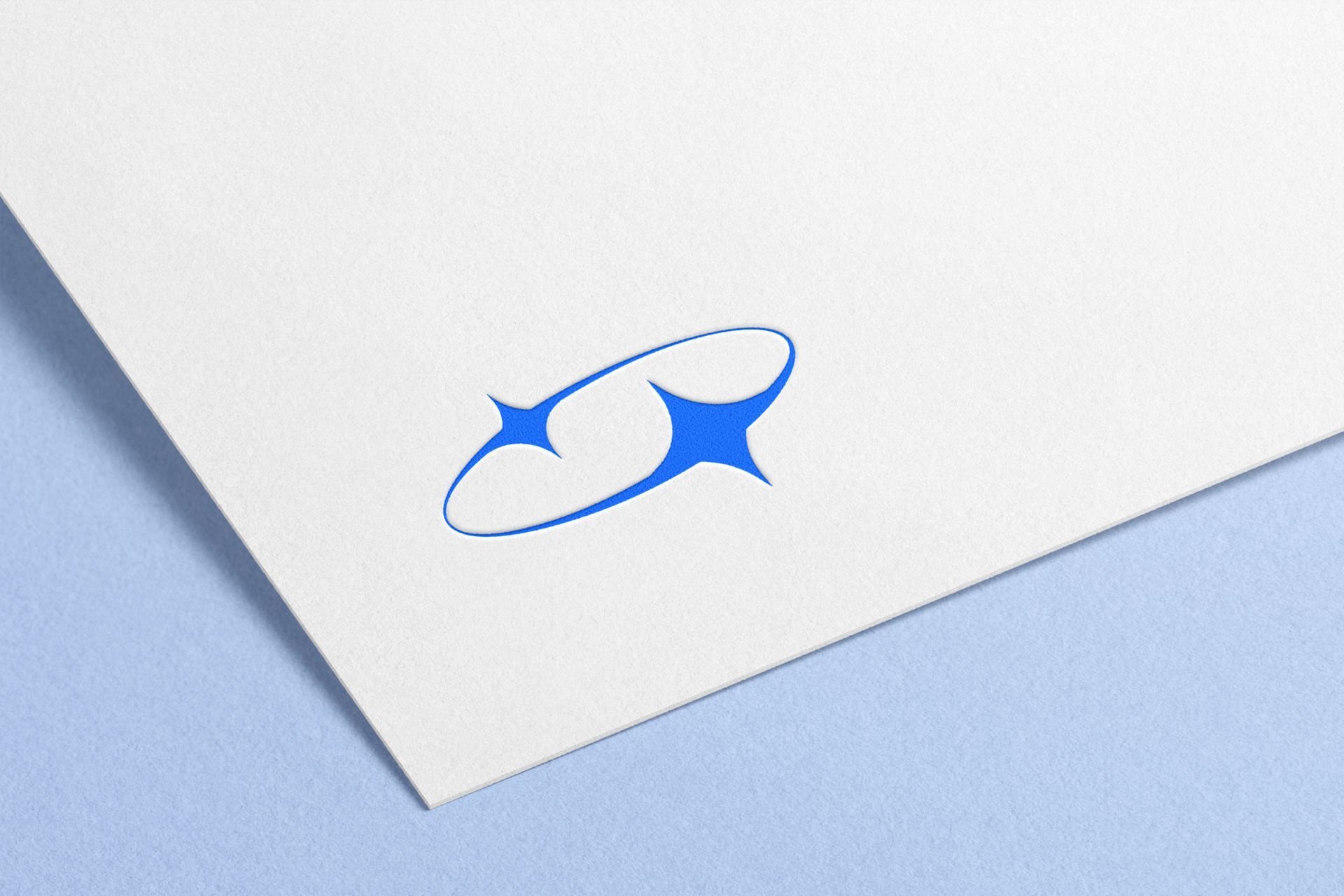
However, there is no chance that Ora Iti’s primary logo will fit in that small space, the words will become unreadable. To solve for this, I created a brand mark to accompany the primary logo. This was also the perfect opportunity to incorporate a little more of Carol and the Māori culture.
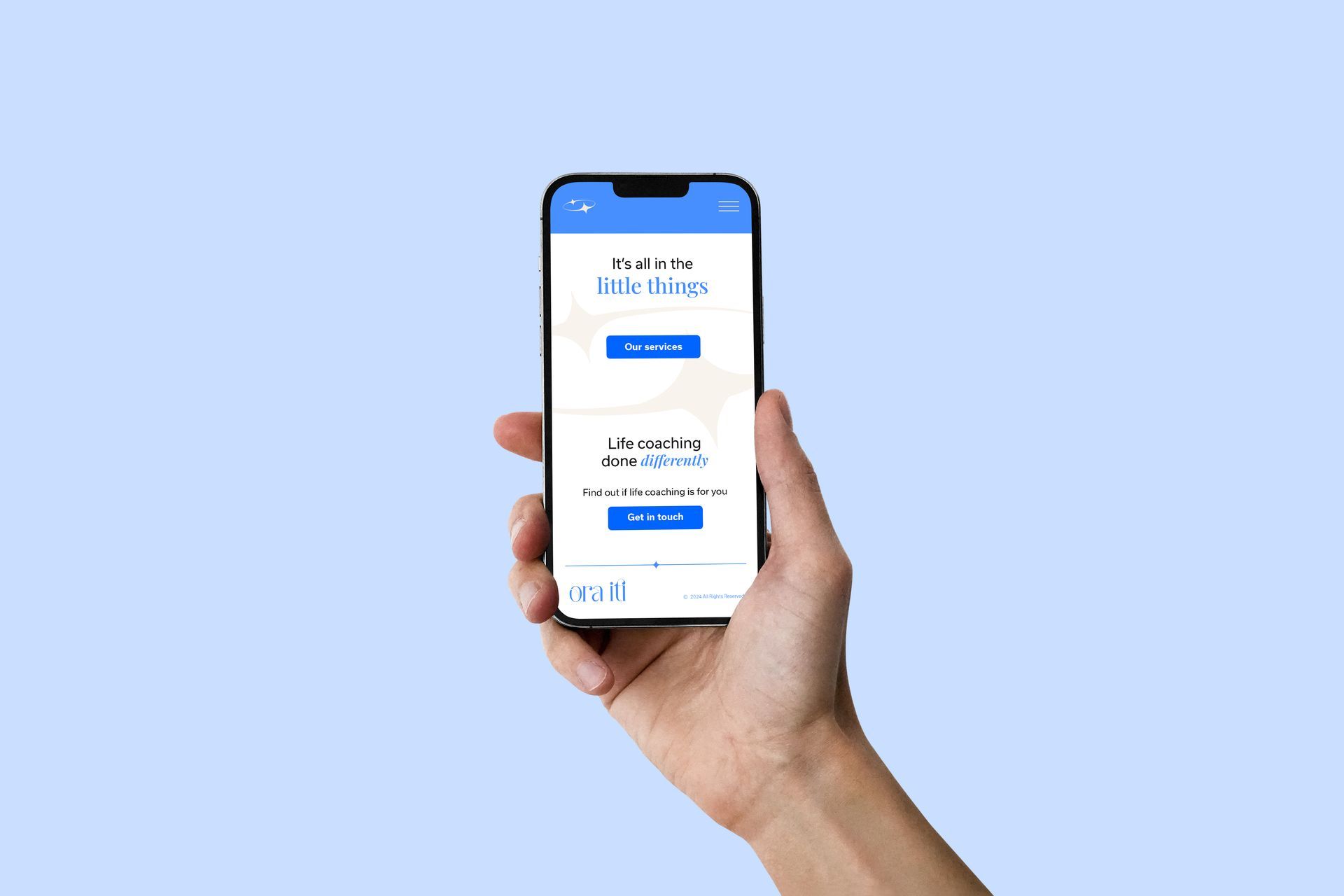
A brand needs to be functional and one version of a logo simply won’t cut it. That’s where logo variations come in. Ora Iti’s full logo suite consists of four marks in total:
- the primary logo
- a word mark (the primary logo without the tag-line)
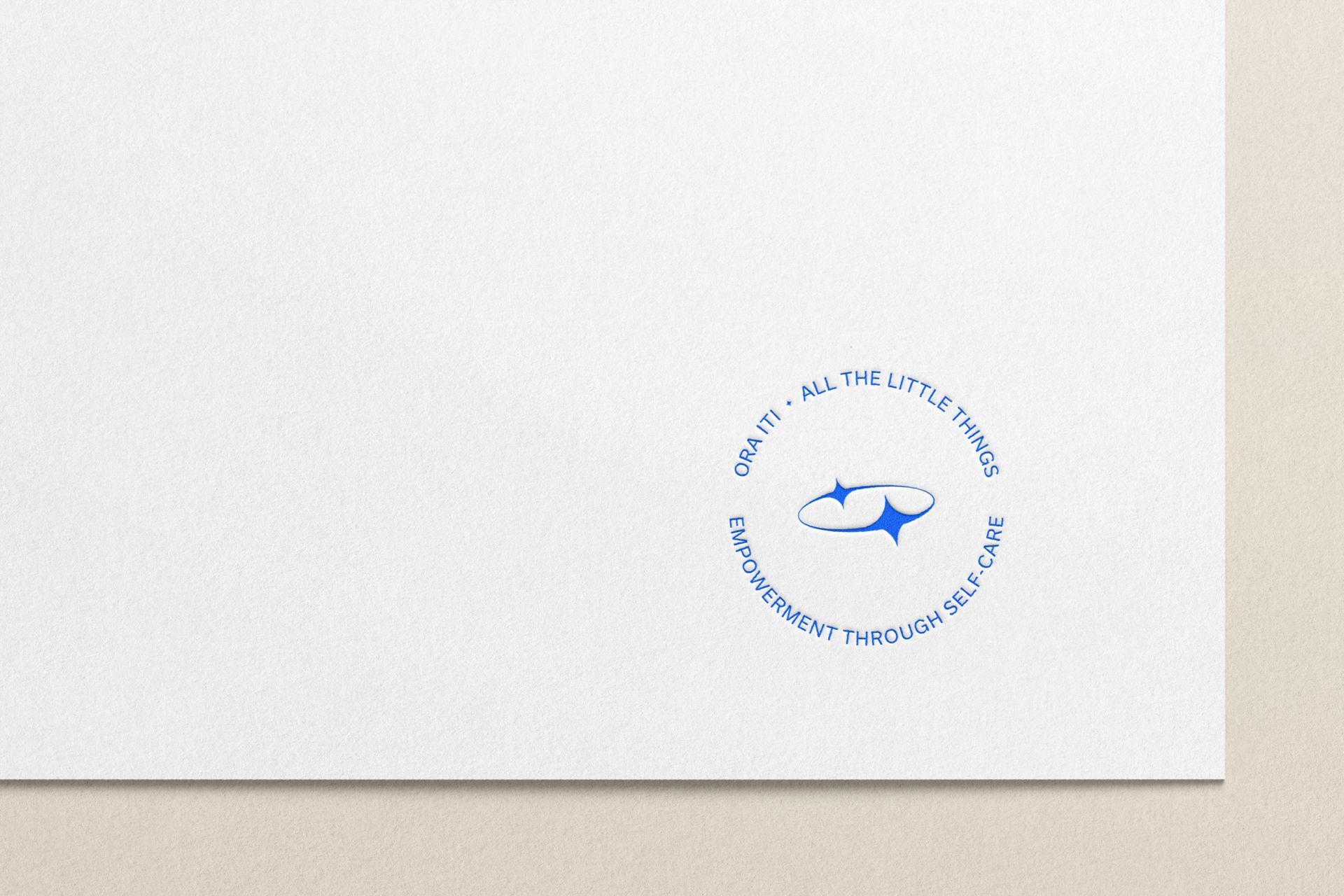
- a brand mark symbol
- a round badge mark
Now the brand can adapt to any size or situation and it will look much more interesting too.