Eastend Cafe
Former owner of this great cafe, Angie, initially got in touch for some communications and marketing advice. Upon further investigation, we realised that her brand at the time was lacking some key functionalities. We decided to do a small rebrand before giving her marketing materials a fresh look as well. This rebrand allowed us to really play with the quirkiness of this well-loved cafe and take Angie's brand to the next level.
Services
Rebranding
Deliverables
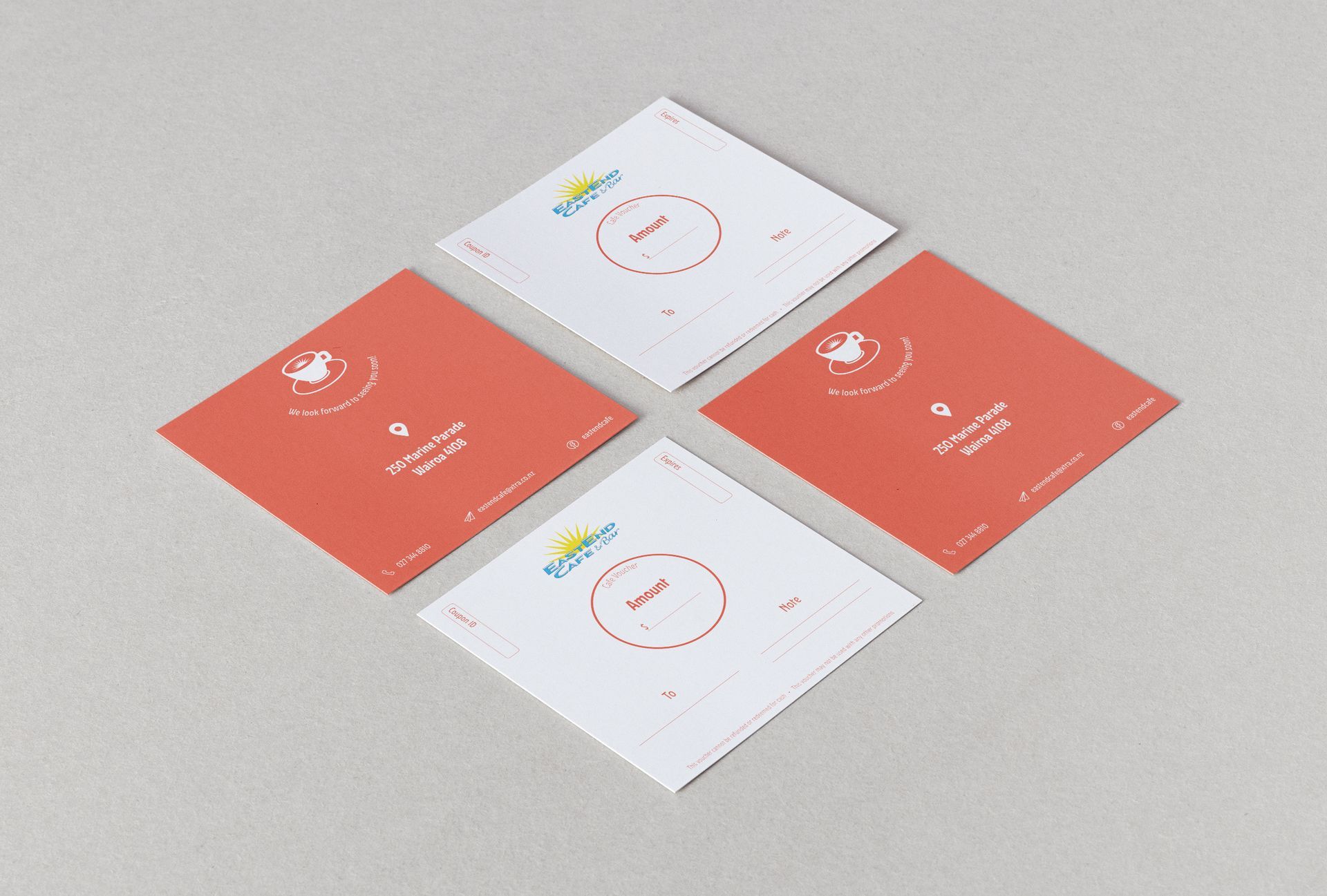
Updated Logo | Marketing Materials | Communications strategy


The Brief
Well-established along the Wairoa river, EastEnd Cafe is loved by many locals and visitors alike. After a rough few years due to the global pandemic, EastEnd wanted to reset and attract new customers.
It was important to retain the cafe's unique and approachable style as that had served them well for many years. So this project was about updating the brand and expanding it, while maintaining the personality many customers knew so well.
A Uniek Solution
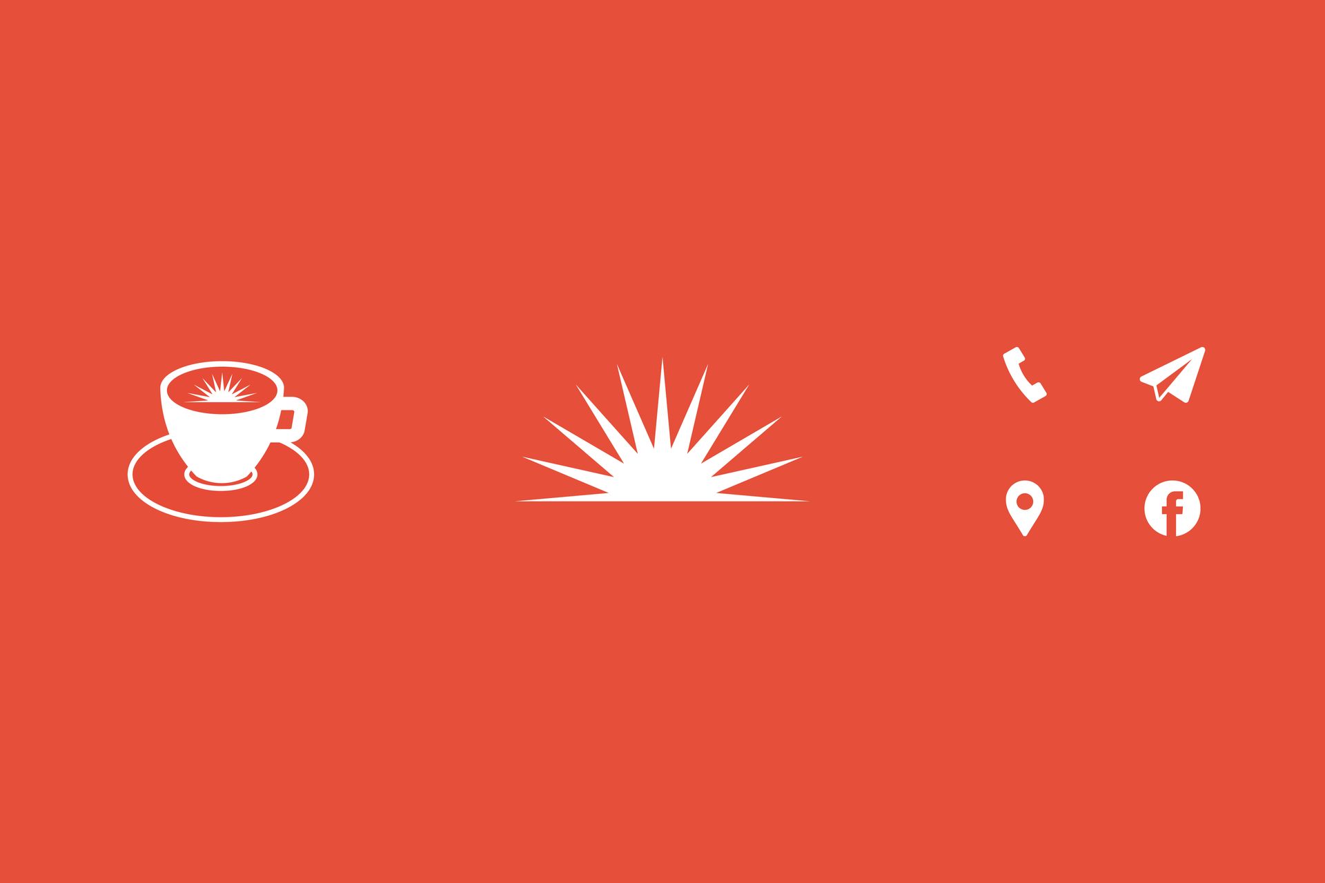
The logo was simplified so it would stand out better while emphasising the brand's personality to a greater extent. The sun, logotype and colours were carried over and altered to suit EastEnd's needs. The sun represents Hawke's Bay, sunny home of EastEnd Cafe, while the light blue colour represents the Wairoa river. A new typeface was chosen to further represent the cafe's personality and values. Vibrant, quirky and homely.
A few icons and graphics were also created for great versatility across all marketing collateral. I also developed a new gift voucher, new loyalty cards, stamp designs, posters, social media collateral and more.